


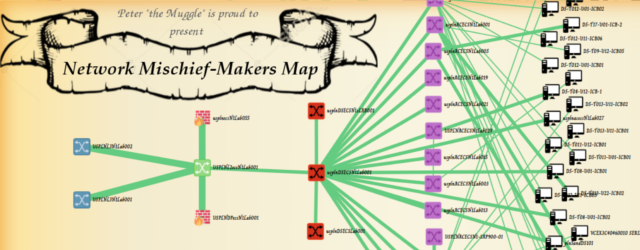


Network Topology Visualization #4 – Interactive Map Using D3 Javascript Library
This will be probably last visualization example for a while because I stopped working with network visualizations for some time now. But I wanted to finish publishing some last examples I have done in the last years for a client with focus on all the basic human controls. This one should be a bit more polished way how to visualize more real world topology and to work with the most common problems of such topologies like:
- Groupiing of devices by type in a layer and multiple sub-groups inside a layer
- Multiple links between the same two devices
- Overlapping links between devices on the same layer
- Basic controls over camera movement using dragging, using mouse wheel for zoom, etc…
So here, I give you the final example, now fully integrated into a simple <div> tag as it allows for dynamic resizing. Might not work as intended on mobile, but that was not the purpose on big datacenter maps.
Interactions you can try:
- Camera pan using mouse drag&drop
- Camera zoom using mouse wheel
- Dragging of network icons around
- Hover over links to see details of the links
- Any link can be “bend” using bazian curves using a middle point (yellow)
Full-screen version of the map above available here.
Cannot really give you the code for download for legal reasons, but since this is all javascript based and D3 is open source, I believe you guys can figure this out, wink, wink …
Contents of Article
Handling non-planar networks and connections inside a layer
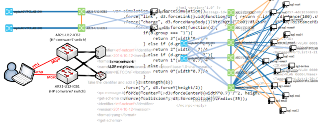
Most networks have exceptions in architecture and some cables that you just need to know about, but might be hidden on diagrams that were created using automation because they are simply hiding below other connections. For this my code is detecting of there is a connection between devices of the same layer and ‘bending” the connection using curves inside SVG logic. Here is a quick example:
Manual X:Y device coordinate positions in the JSON
You noticed that on the diagrams you can drag the devices around the map, but what if you actually want to make these placements permanent? There is no “save” function for now, but since we are reading a JSON, there is a way there to put X:Y positions into the JSON to force a specific position for a specific device on the map. This will allow you to make some special devices to be not part of the dynamically calculated layers.
For example here I made the terminal server machine to be standing between two layers to the side with simply giving it’s JSON this part:
{
	"deviceId": "Terminal Server",
	"name": "Terminal Server",
	"zone": "1",
	"hardware": {
		"vendor": "HPN",
		"model": "MSR30-20 Router",
		"type": "OOB Devices"
	},
	"visual": {
		"icon": "icons/terminal.svg",
		"y": 214.7468032836914,
		"x": 797.0391235351562,
		"zone_group_key": 1
	}
}
And here is the result of such device mixed into the JSON:
Multiple links between two devices
As you might have noticed, I used simple color coding to indicate type of links, e.g. fiber is black, copper is metalic orange, logical REST API is dotted blue, etc… But what if there are multiple links between devices. Well simply the colors are mixed using dotted separation, up to 3-4 colors mixed this way. And on-hover menu will tell you more. Check this example and hover your mouse over the links:
Conclusion
In conclusion, this is the end of my publicly available work on this visualization as this system started working now for me commercially in my consultancy and monitoring solutions where the JSON is constructed automatically based on interaction with network devices and vmware’s vCenter (where I am getting VM-to-ESX mappings). So I hope this inspired you a bit and demo code can be downloaded here.