


Network Topology Visualization #3 – Exploring other D3 visualization options for a DataCenter
Contents of Article
Foreword
First a disclaimer #1, in contrast to the previous articles, here I will NOT describe the collection of data that will be visualized because these datasets were manufactured manually for the sake of example. So this time I will just say what was the target behind a given visualization example and give you a link to a live demo of it. You can examine the code and source JSON files yourself using the usual browser developer tools and should be fairly easy to adopt.
Secondly a disclaimer #2, the examples here were developed as part of a part-time job with company called Langner GmbH. (visit Langner.com), as a form consultancy exploring options of enhancing their OT-BASE software with some javascript/D3 based visuals. This engagement ended in early 2020 (so more than a year ago now) and they were kind enough to give me permission to publish some examples here. With data properly anonymized.
So let’s get to the examples. There is a total of 4 examples and I will NOT explain them one by one in detail here much (e.g their code). However it should be fairly easy for you to just grab the files from your browser when you visit the live demos and check the code, most of them are anyway based on D3’s example library, just applied in a more datacenter and network specific way.
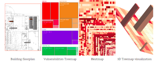
Building’s interactive floorplan
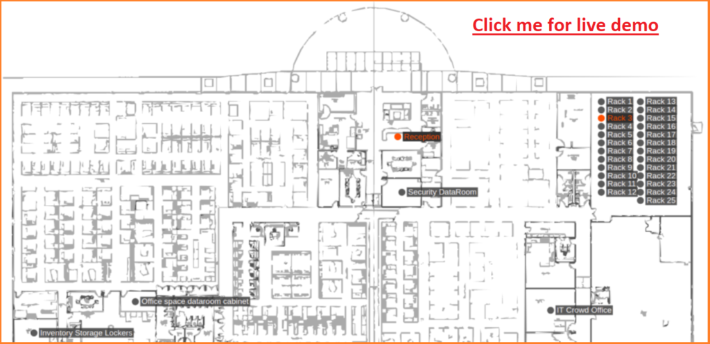
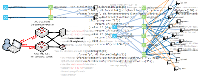
D3 library can visualize a building floorplan using the same principles as in the past we used for network map, however here I have improved the interactivity to be based on dragging with mouse and scrolling with mouse. On-hover inforgraphics can pop-up on points of interest. All driven by a central JSON file that holds the points of interest coordinates.
Threemap for prioritizing tasks/threats/anything
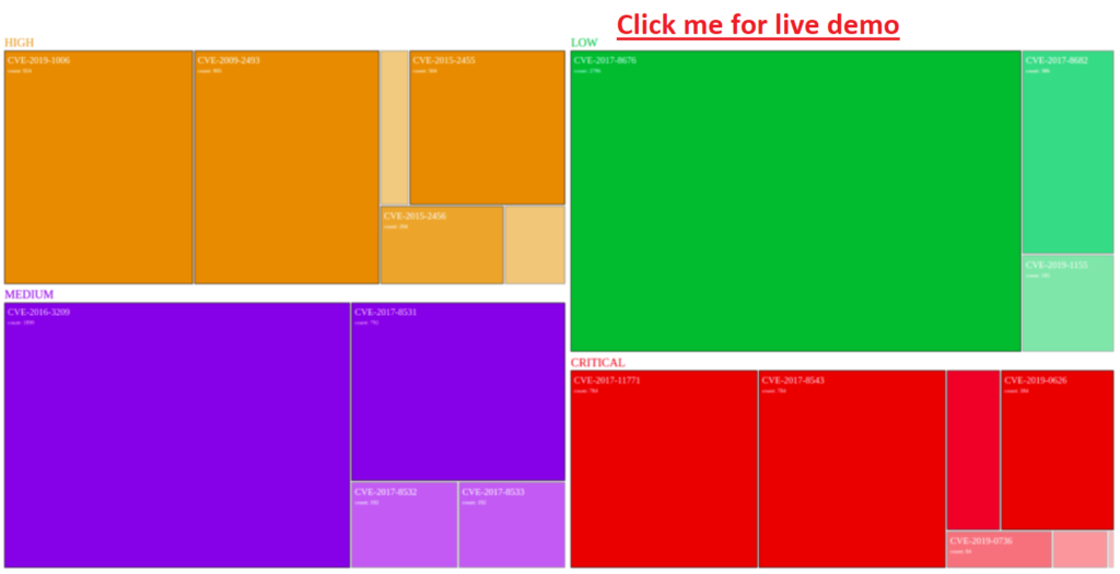
Using visualization, it can be very helpful to understand what items in your system are more important than others, also colors are great to categorize them. Above is an example that in 4 main categories is using size and shade of a base color to visualize the most abundant vulnerabilities in the system. Again driven by input JSON.
Heatmap of large number of vulnerabilities
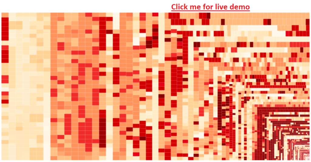
Now building on top of the previous example, what happens when you have many, many items in your system, and you need to visualize two vectors of their importance, fist how many times it was detected and secondly how important it is. Here a heatmap can be very helpful. The size of a box represents the relative size to other items and color going from white to dark red represents it’s criticality.
3D Heatmap for a third attribute
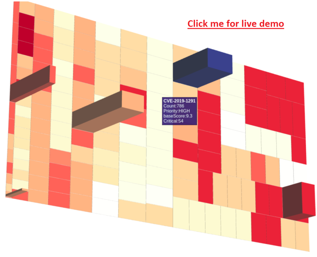
Now if amount of data is not a problem, but how about a third attribute, we already used count for size and color for criticality, how can we add a third attribute to the same heatmap, here a 3rd dimension and a change to the code is needed. Using some examples I got from the internet(s) here is a super amateurish 3D heatmap, with an artificial 3rd attribute of “critical”. You can use dragging to rotate the whole heatmap and pop-up appears above items with details.
Summary
In summary, there are just extra examples that I felt can help out someone out there learning or working with the D3 library in the datacenter realm. And a big thanks to Langner.com for sponsoring this work and providing anonymous data to visualize. Additionally, be on lookout for next part of this visualization series as there is already a more advanced version of the network visualization map in the works.